Top Stories
- Know Everything About Nipah Virus, Which Is Back In Kerala Again
- Kevin Porter Jr Arrested On His Girlfriend’s Assault Charge
- Market Change Overnight - Know The 8 Things That Did It
- Who Are Alba Baptista And Chris Evans Married On The Weekend?
- Disrupted India vs Pakistan Asia Cup 2023 Match on Reserve Day
- 10 Common Foods That Contain No Calories or Are Very Low in Calories
- Men’s Styling Tips - Know the 9 Common Style Mistakes to Avoid
- Coco Gauff Beats Karoline Muchova and Reaches the US Open Final
- Danny Masterson Gets Life Sentence of 30 Years for Two Rapes
- Experience A Splendid Vacation in Kashmir with These 15 Gorgeous Sights
- India
- Saturday , July 27, 2024
- Last Published Sep 12, 2023, 6:48:32 PM

- byAll That Trending
- September 06,2023
Tropical Storm Lee Changes As A Dangerous Hurricane By Weekend


News


Latest Reviews

- Sep 01,2023
Love All Movie Review - A Good Sports Drama T...

- Sep 01,2023
Love All Movie Review - A Good Sports Drama T...

- Sep 01,2023
The Equalizer 3 Review - Repetition of Crime,...

- Sep 01,2023
One Piece Review - The Translation of The Ani...

- Aug 18,2023
AP Dhillon First Of A Kind Review - An Inspir...
Web Stories


Sports


Science & Technology
- byAll That Trending
- Sep 06, 2023
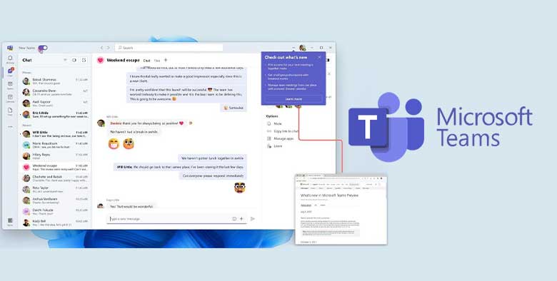
Microsoft Teams - Everything You Must Know About It
As a cloud-based team collaboration tool, Microsoft Teams is a part of the Microsoft Office 365 and Microsoft 365 suite of applications. It is a separate application in t...

- byAll That Trending
- Sep 05, 2023
Garena Postpones Free Fire India Launch - What You Should Kn...
As per the company announcement in the last week, Garena was to launch Free Fire India on the 5th of September 2023, today. However, as per new announcement, the relaunch...

- byAll That Trending
- Aug 30, 2023
Jio AirFiber Launch On Ganesh Chaturthi - What Should You Kn...
In the 46th Reliance Annual General Meeting (Reliance AGM 2023) held on 28 August 2023, Mukesh Ambani, the Chairperson of Reliance Industries, announced the launch of Jio...

- byAll That Trending
- Aug 25, 2023
Chandrayaan 3 - Know Its Full Story With Its Mission, Goals,...
The 23rd of August 2023 was a very precious day for all Indians as it marked the successful and soft...

Newsletter
Subscribe to Our Newsletter

Subscribe our newsletter to stay updated every moment